All posts by diamond6893

Isolation Through Negative Space: A Photographic Journey

 A Photo Essay

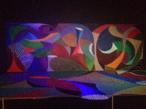
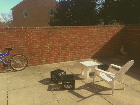
The concept for this photo project started from my very first word photo, which was isolation. I really enjoyed exploring how to make a visual representation and wanted to apply it to a series down the road and found this opportunity was too good to pass. I also aimed to challenge myself for this project, and found the best way to do so was to explore this concept of isolation by using negative space to represent isolation. This photo essay shows my gradual struggle to grasp this concept, some of these photos are not my best, but that is to show and reference my journey. The first photo in this series is of a a portion of a tree with a background of sky. This photo was taken through my iPhone 5’s camera with the stock lens. I then put the photo through a free photo editor called VSCOcam, which is a simple yet powerful photo editor for smart phones, this was the combination of tools that I used for not only this project, but for the entire semester. I wanted this photo to almost look like an impressionist painting and make the pixel differentiation look like brush strokes. The final product reached that goal, but I feel that it still looks somewhat amateur. The next photo in the series is of a series of lockers, one of which has a face drawn it and is frowning. This picture was taken when I was looking at isolation as being a bad thing generally speaking. I feel that this picture does not capture negative space quite as well as I really wanted, but the idea was to have the lockers blend in a way that the face would stick out more. I also wanted to make this photo. There were a few rays of light that I wanted to accentuate subtly, which I got by pushing up the grain and saturation on the picture. The next two photos in the series showed my struggle to edit lighting within a picture. They both capture my struggle with lighting, although the second one I was much happier with the outcome, especially with the how the LA quad acts as the negative space. The next photo is the end of what of the darker photos. This one is from a concert and I wanted to convey the dynamic of a concert and how one can be isolated in the spotlight. The next photo is my attempt at a top down negative space photo. I used my roommates Flyers gnome, and put it upside down to change the photo’s composition a little bit. I’m very happy with how the lighting came out on this, it’s a mix of natural light from the window which was a foot away from where the photo was taken as well as a mix of light from my apartment. Next is what I call the black and white portion of the series, which consist of a few pictures from a weekend at home in Philadelphia. The first picture was taken from the art museum steps and was intended to highlight the city as whole while comparing it with the negative space of the sky. The next photo is of the Ben Franklin bridge going into New Jersey, I wanted to use the water as the negative space. The last in this section is of an AU rubiks cube that I found on my patio. I wanted to play with intense focusing, while still utilizing heavy negative space. I’m incredibly proud of this picture and how it came out. Finally I wanted to touch on the last picture in the series, because it is noticeably different from the other pictures in the series. This is a picture of the sun, through a pair of glasses that filter out UV rays. I found this was a unique opportunity to use the sun as the object itself with a fear of lens glare, although I’m sure you’ve noticed at this point that I love how lens glare looks within pictures.


Snails Space Critical Review

Snails Space Critical Review

This piece I initially walked by without really paying close attention to it. I read the plate giving little bits of information, and it said that David Hockney (the artist) was deaf, meaning that he focused primarily on the aesthetic of the piece. There is a 10 minute loop that brings out different aspects of the piece, almost telling a story solely through lighting. I sat down during the “red” portion, which highlighted the smaller aspects, such as the smaller dotted portion on the bottom left. As it progressed it went to a deep blue which really made the white on the top left pop out. I really like that you almost could not focus on one portion at a time, my eyes was constantly focusing on different aspects of the instillation. As I sat there it truly made me think about focusing on the visuals, with a complete lack of sound. How even though I heard the slight hiss of the projector and lights, they infringed on the piece itself, this is as much an experience as it is a art piece. Knowing that the artist is deaf helped me realize why he made the piece so intense. The visuals are literally everything to him, and this is transposed to the piece, which comes to life the more you watch it. In the mere 10 minutes that I sat and watched, I found a dozen different portions that completely stood out over time. This is why I love art, the longer you pay attention to it, the more that you will not only find in it, but the more you can learn from it. David Hockney piece has quickly become one of my art installations I have seen in a very long time.

Relaxation (Self Portrait 2)

Relaxation (Self Portrait 2)

For this photo I really wanted to make a comment on stopping and relaxing. It isn’t everyday that you get to sit down and do nothing, but sometimes that’s really all you need. I started editing this picture by first playing with the color balance. I then went into the exposure and adjusted the gamma correction and offset the exposure slightly to give the photo a bit more of a polaroid feel. I then went to the channel mixer and enhanced the constant, which added to this effect.

Critical Review of the Opening segment of Se7en

The title sequence for the film Se7en, is almost haunting. Throughout the scene the text looks handwritten and scribbled.Behind the text is a montage of scenes from a crime scene which may be alluding to the story of the film. The use of quick edits along with the music choice cause tension which makes the viewer both interested as well as warry. The text is also placed randomly throughout the screen causing the viewer to be on the edge of their seat through out the title sequence. This abstract use of “handwritten” text is a staple for the horror genre, you can see the clear influence this film had on films such as Saw and Hostel. Part of what makes this segment so eerie how they have the names fade in and out, it’s quite frankly ominous. You can see in several points throughout the title segment how the name repeats, almost as if it was burned on to the film and somebody had not developed it properly. The title sequence heavily relies on negative space to accentuate the tension as well as using the backdrop of a crime scene or evidence lab and having the names fit into the scene. This title sequence also has a fairly bleak color palette, relying heavily on black and grey whilst throwing in some blues. These dark colors also add to the somber yet tension filled scene which echos throughout the film as a whole. Finally the use of doubling by way of transposing a film on top of the same shot is a very clever way of making the audience uncomfortable while still being visually appealing. This trick I found to be incredibly interesting especially if they were using real film.

Wristcutters A Love Story

Wristcutters A Love Story

This poster is for a film called Wristcutters A Love Story, which although it sounds like an incredibly morbid film, is actually an incredibly inspiring film, as well as being one of my all time favorite films. To start the poster is clearly obeying the rule of thirds. As you can see the street sign is just overlapping on the middle quadrant of the poster, but it does so in a way that is not intruding on the rest of the words on the poster, it actually compliments them. The poster also uses a very limited color palate. The colors used are incredibly basic, but they make a point about the movie, especially the extremely limited use of red within the poster. Red can be seen on 3 parts of the poster, the words “A Love Story”, the cut on the wrist, and finally the drops of blood, which are shaped like hearts. These blood drops are really what transforms this poster from something that looks very dark, into a dark comedic, almost ironic picture. The movie is about hope, and I think this is what the hearts convey to the on looker, the fact that even though someone is at their lowest moment, that there can always be hope in the world. To expand on the picture as a whole, the use of a street sign also makes points out a few of the other pieces of the story in the film. The film takes place in purgatory, which is littered in these signs, meaning they don’t want the people to repeat their decision to take their own lives. (SPOILER) Ultimately some people in the film do, but it ends in an even worse way for them. Essentially that’s what this simple yet powerful poster is conveying about the film.

A Dramatic Take On Facebook: A Critical Review

I really like this ad. I think it’s an incredibly simple way of conveying the idea that sprint allergy has the best coverage. By having two incredibly well established and talented actors over dramatizing the actions happening on sprints network, it shows that they think they are important. Something as small as sending a friend request is built up to be grand. The initial wide shot, shows James Earl Jones and Malcolm McDowell standing, wearing tuxedos. This also intensifies the idea that it is important, that the consumer is worth them dressing up for what would normally be considered award show attire. The decision to keep the backdrop as a plain black is interesting. Normally in these types of ads we see the stars of the ad showing off the product, here the actors are acting as if they were the product. This is another interesting take on Sprint. By the actors being a manifestation of the phone, they are hinting that Sprints phones are of the same caliber as the actors. This implication is not one that would be immediately apparent but after some deliberation as well as talking to several people on the matter we all came to a similar conclusion. As for the camera work, there is little to no camera work. Rather the director of the ad utilized quick edits in the film to make the ad move more. After Malcolm McDowell and James Earl Jones have their little facebook exchange, an announcer type voice comes in with the standard phone commercial background and plugging the different aspects that make this a superior product to other companies. The font used is incredibly sleek as well as the transitions for words being very quick and smooth. The addition of yellow as the background also is a nice change from the black backdrop in the previous shot.